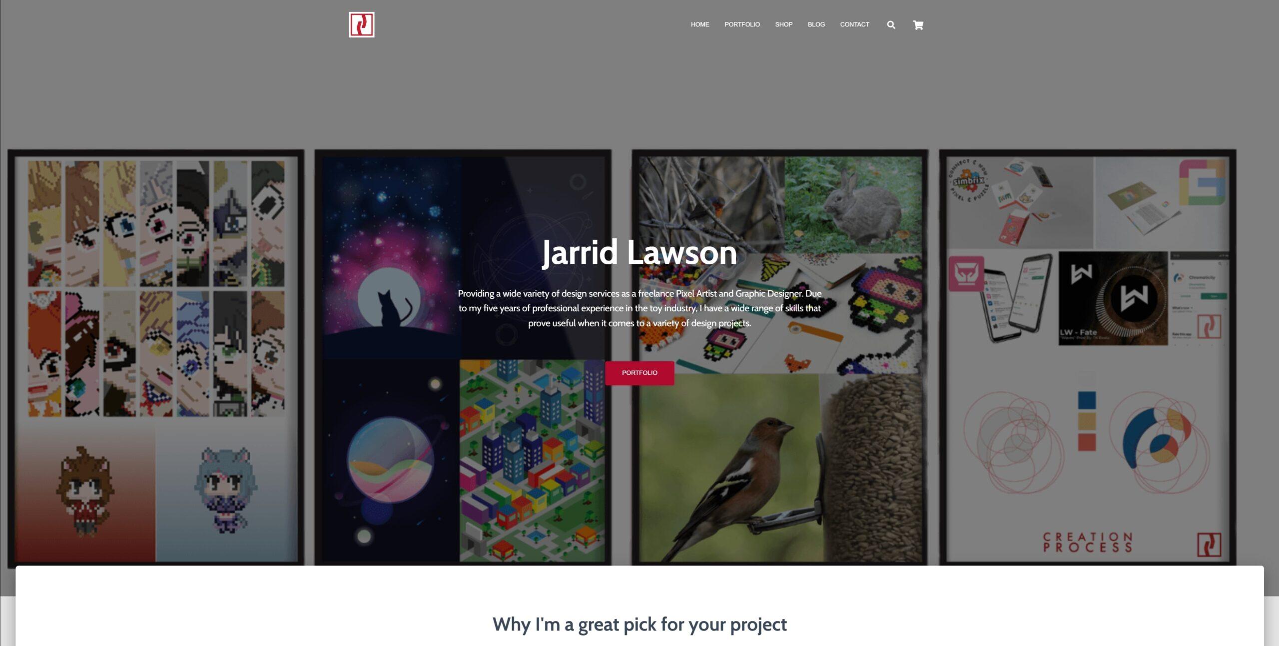
A brand spanking fresh look!
You can see I’ve got a new website layout and overall look, and I’m really happy about it.
Here is a video of the old site for your reference if you are a newcomer to the site.
I realized my old site wasn’t doing and providing what I wanted. It’s confusing, in my opinion. There are some items that don’t seem to be labeled correctly to me. I would not want my clients looking for freelance help, fans of my pixel art and illustrations, or potential employers looking for my portfolio to get confused.
I was basically trying to fix the current site and make it more functional for users. However, I had so many ideas for my site, I felt it would be far better to start from scratch. That’s what I did.

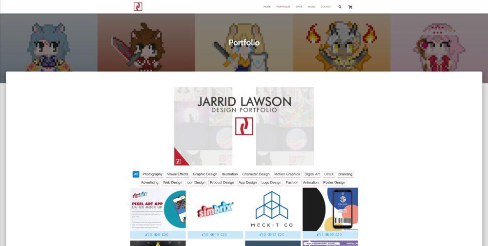
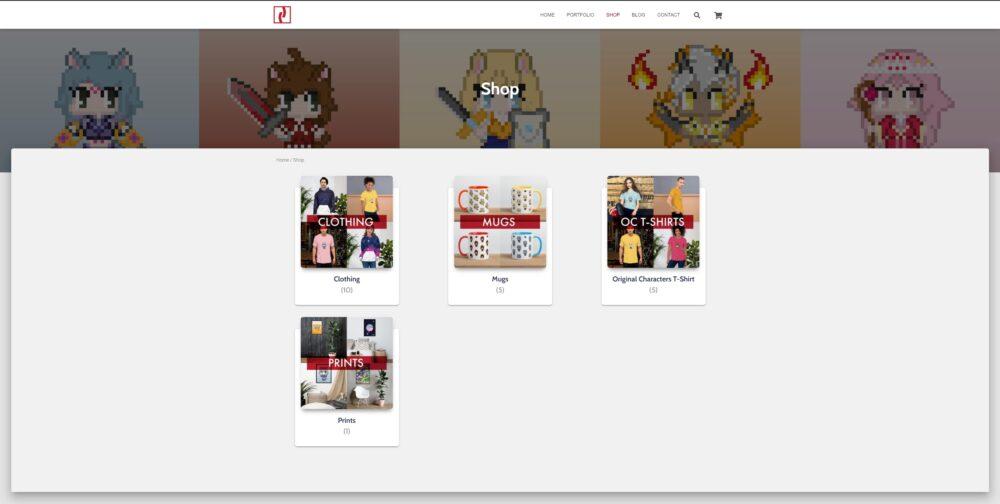
I got some really cool plugins to display my store in a better way. I have also kept some aspects of my old site as I really liked them but improved them.
I setup the site with the understanding that 3 types of people would be coming to the site. I needed to make it as easy as possible for them to find my site. So I came up with the idea to add in what everyone coming to my site needs to see “What I do” -> “About me” -> “Products (Show my designs in different environments)” -> “Client reviews” -> “Clients I worked with” -> “Contact me”.
During testing with customers/people coming to the site, I think this flow works best. This was achieved with HotJar and the data from testing with friends and family that came on to my site.
I’ve redesigned my site. Currently, everything is running how I like it, but there are still some things to work out. Please let me know what you think of my redesigned site so I can make it better.
